Maximize Efficiency: Dynamic Blocks in Bloomreach Engagement Explained
Dynamic blocks (or HTML blocks) are customizable pieces of HTML code that can be saved and reused across multiple email templates and web elements. Why are they useful?
Dynamic blocks (or HTML blocks) are customizable pieces of HTML code that can be saved and reused across multiple email templates and web elements.
Why are they useful?
Imagine a situation where you have loads of email campaigns with 100+ active email nodes/creative assets.
Suddenly there's a small graphic change that needs to be applied to all of your campaigns.
For example, the logo of the brand in the header changed. Or the HQ changed its address. Or the landing page links changed.
To implement these small changes EVERY active email creative asset needs to be changed
This process can usually take quite a long time…
But if you're using dynamic blocks they can spare you hours of manual work.
Because if you change a code in one dynamic block, this change will be applied in every email asset the block is used in.
Let's see what this looks like in practice:
Dynamic Blocks - How to Use Them?
To create a dynamic block, you can use the HTML editor within the Asset Manager or the HTML editor in the email campaign interface. These blocks can then be integrated into all your templates.
What are the most common types of dynamic blocks?
Dynamic Blocks are best utilized for parts of the email creative campaigns that are repeated across many campaigns and contain personalization.
Let's take a look at 9 types of email assets implemented with dynamic blocks; that our clients are using:
Header
Menu
Footer
Navigation
Product Recommendations
Visit Your Local Store
White Pixel
Omni-channel Welcome Discount
In Your Size
Header
The header is a part of the email that will probably be used in all of your creatives. This makes it a perfect candidate for turning it into a dynamic block.
The header typically contains the logo or branding of the company, and in some cases also the preheader text. It sets the tone for the email and helps to reinforce brand identity.
Your header can be either static or you might include some personalization - such as cart count (current number of items a customer has in her cart) in the example below:
Menu
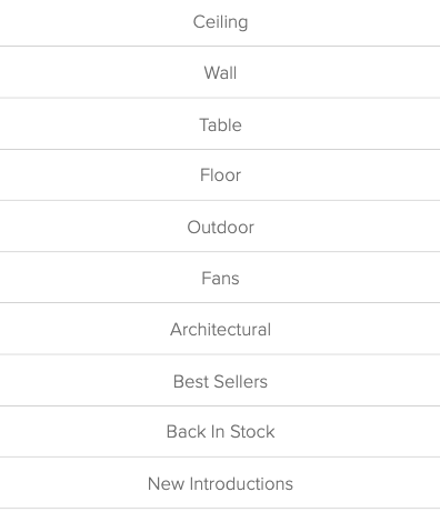
The menu contains quick links to the most important sections of the website or different categories of products. It allows recipients to easily navigate to specific parts of the website directly from the email, enhancing the user experience and promoting engagement with the content.
Footer
The footer of an email usually contains important information such as contact details, social media links, unsubscribe options, and legal disclaimers. It provides essential links and information that is relevant but does not need to be in the main body of the email (ensuring compliance with legal requirements and maintaining transparency).
The footer is another part of the email that should be used in all of your creatives (for legal reasons). This makes it another great candidate for a dynamic block.
Navigation
The navigation contains elements with links to the different categories of the website, making it easier for users to find relevant information quickly.
Product Recommendations
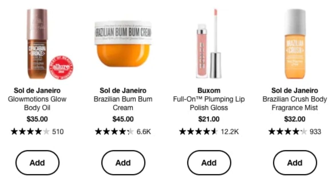
Product recommendations are personalized suggestions for products or services based on the recipient’s previous behavior, preferences, or purchase history. They aim to increase engagement and drive sales by showcasing items that are likely to interest the recipient.
Visit Your Local Store
This section includes information and a CTA encouraging recipients to visit a nearby physical store location. This section often contains:
Store Locator Link: A clickable link or button that directs the recipient to a store locator tool on the website, where they can find the nearest store based on their location.
Store Details: Information about the local store, such as its address, phone number, and operating hours.
Promotional Information: Any ongoing promotions, sales, or events specific to the local store that might incentivize the visit.
Map: A small map or an embedded map link to help users easily find the store.
Personalization: With access to the recipient's location data, this section might be personalized to show the closest store automatically.
White pixel - a Placeholder for Promo Messages
The white pixel can serve as a designated section within the email template left intentionally blank, allowing for the easy insertion of promotional images or offers when needed. It acts as a flexible space that can be customized based on the specific needs of a campaign.
Think of it as an opportunity for Black Friday or any seasonal offers:
When a seasonal offer comes you'll just put your message there (replacing the white pixel).
When the promo is over, you'll just delete your message from the dynamic block.
This will automatically reflect in all of your campaigns.
No need to manually intervene with each email node by itself.
Omni-channel Welcome Discount
You can increase conversion rates by personalizing follow-up emails. One of the examples is encouraging users who received the Welcome Discount Coupon to make a purchase by reminding them of their discount.
The Omni-channel Welcome Discount consists of 3 parts:
Email: Dynamic Snippet
Website: Targetted discount call-out
Cart Abandonment: Subject Line Personalisation
The dynamic email snippet ensures that users who received but haven't used a welcome discount coupon in the last 30 days get a reminder in the email header:
In Your Size
You can add another level of personalization by showing your customers recommendations based on their size and color preferences:
This section will only be visible to customers for whom we have size and color information. The others will see the version without this personalization.
Email Management Tips and Tricks in Bloomreach
Let's have a look at some useful features in Bloomreach:
Creating HTML from Visual Builds Feature
Did you know you can generate HTML files directly from visual designs?
Here's how you can easily convert visual elements into actual HTML:
a) Save as HTML
b) This will create an HTML file:
c) You can then copy and paste the HTML into a New Dynamic Block:
Data & Assets > Asset manager > Blocks > Create new:
And now you can use the block in any of your campaigns.
Optimal size of HTML Blocks
Did you know that there's a 100KB recommended limit for email size?
It's best practice to keep the sizes of your single emails below 100KB - this ensures your emails are both deliverable and readable for all recipients (most email clients and servers).
If you choose to use Creating HTML from Visual elements (mentioned above) keep in mind that the sizes of blocks created this way may not be optimal and you might need to optimize the code.
And how to optimize the code?
As a general rule of thumb, you want to avoid repetition and remove any excess data or unused code:
Avoid nesting tables where not required - most things can just be <tr> after <tr>
Set your styles on the <table> so they cascade down
Things like font styling and alignment can be set on the <table> and affect all its children e.g.
<table style=”font-family: Arial, sans-serif; font-size: 12px; line-height: 16px;” >
Don’t use spacer rows
Padding is just as reliable and uses a lot less code! e.g.
padding: 15px 0;
Remove your <tbody> tags - you don’t need them
Don’t use <p> tags, set your styles on the <td> above instead and keep it efficient (See comparison examples on the next slide)
Keep your styling efficient, if it’s not used - remove it
(Source: Bloomreach's Best practices to avoid clipping)
Hide on Desktop/Mobile Feature
This feature allows you to selectively display or hide specific elements based on whether the email is being viewed on a desktop or mobile device. This ensures that the email's design and content are optimized for the best user experience on each platform.
It also helps you deliver content that is most appropriate for the viewing device, such as larger images or detailed information on desktops; and simpler, more concise content on mobile devices.
One of the examples for using the Hide on Desktop/Mobile Feature can be the following:
You have a) an email product grid visually designed for desktops (2x rows and 3x columns) and b) an email product grid visually designed for mobile (2x2).
Instead of spending time to make sure the device is responsive, you can use this feature.
Here's how you can hide parts of the content on a mobile device:
Dynamic blocks based on Segmentation Targeting
There's a possibility to customize email content for different audience segments.
With this personalization approach, you can show tailored messages and offers and decide to include/exclude a specific segment.
You can use segmentations like these:
Blocks intended only for B2B/VIP customer
Blocks intended only for users with an unused coupon
Blocks intended only for users whose birthday month it is
And how to do this in Bloomreach?
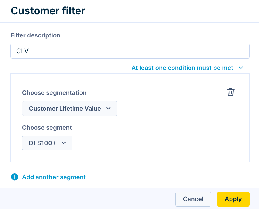
a) In row properties under “Display condition” choose “Set segment/s”
b) Then you can set a Customer filter based on your preferred Segmentation:
Summary
Using dynamic blocks and Bloomreach features in managing your email campaigns can save lots of hours by allowing reusable, easily updatable content across multiple templates. They also reduce the potential for human error.
Additionally, dynamic blocks enhance personalization and flexibility, enabling quick adjustments for new offers or seasonal promotions, and ultimately driving better engagement and higher conversion rates.
If you found this post valuable…
We hope you found this article valuable. If so, please consider subscribing (for free!) to receive updates on our latest publications.
Additionally, if you think someone else might benefit from this information, we would greatly appreciate it if you could share this article using the button below.


