

Our Approach to Structuring Email Reporting in Bloomreach Engagement
Discover the four key areas we monitor in Bloomreach Engagement for email reporting, along with the key metrics and views included in these reports.

In this article, we’ll walk you through our high-level perspective on how we structure email marketing dashboards. We’ll explain which areas of email marketing we believe are most important to monitor and outline the key KPIs we track within each of these areas.
The 4 most important areas to monitor in email marketing
In our experience, there are four core areas that should be monitored in any email marketing program:
1. Email Newsletter Performance
These dashboards focus on tracking the performance of your newsletter campaigns, helping you understand how your broadcasts engage subscribers and drive results.
2. Email Flows (Triggers) Performance
These dashboards monitor the performance of your automated email flows (or triggers), allowing you to evaluate how effectively each flow supports conversions.
3. Email Collection Performance
These dashboards measure how effective you are at collecting new subscribers across different touchpoints on your website, such as pop-ups, forms, and landing pages.
4. Email Subscriber Performance
These dashboards assess the quality of your email subscribers. They typically answer questions such as:
How many subscribers convert within a given time period?
What is the average value of a subscriber?
How many subscribers remain active and stay subscribed to your newsletter over time?
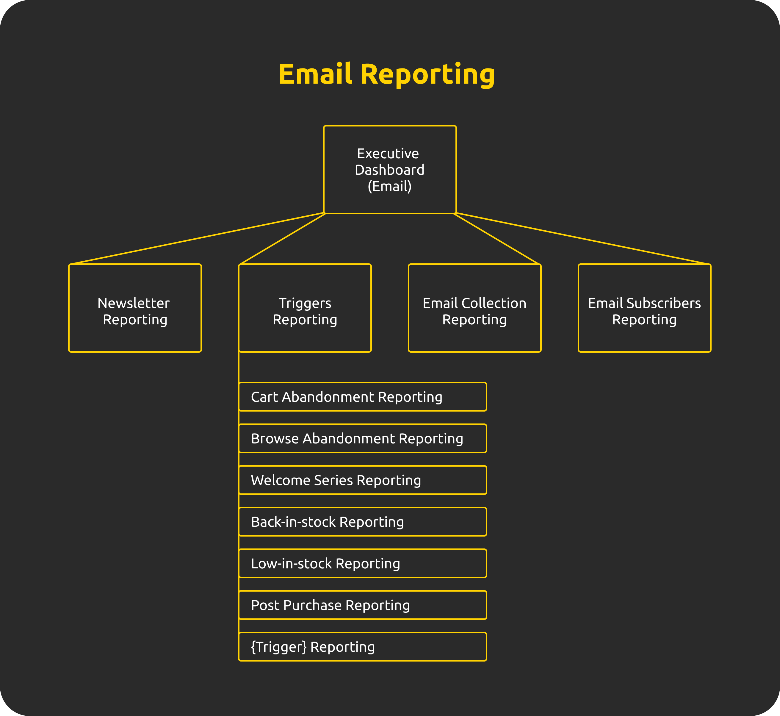
How we structure email reporting
This framework also reflects how we typically structure our email reporting.
We usually start with an executive dashboard that provides a high-level overview of performance across all four areas. From there, we create dedicated dashboards (or a set of dashboards) that dive deeper into each individual area.
For email flows, we often go a step further by creating a separate dashboard for each flow. This approach provides highly actionable insights and is an invaluable tool for continuously improving the performance of individual flows.
Below is a diagram illustrating how we typically structure email reporting.
Now lets have a look at key metrics that we typically monitor in each of these areas.
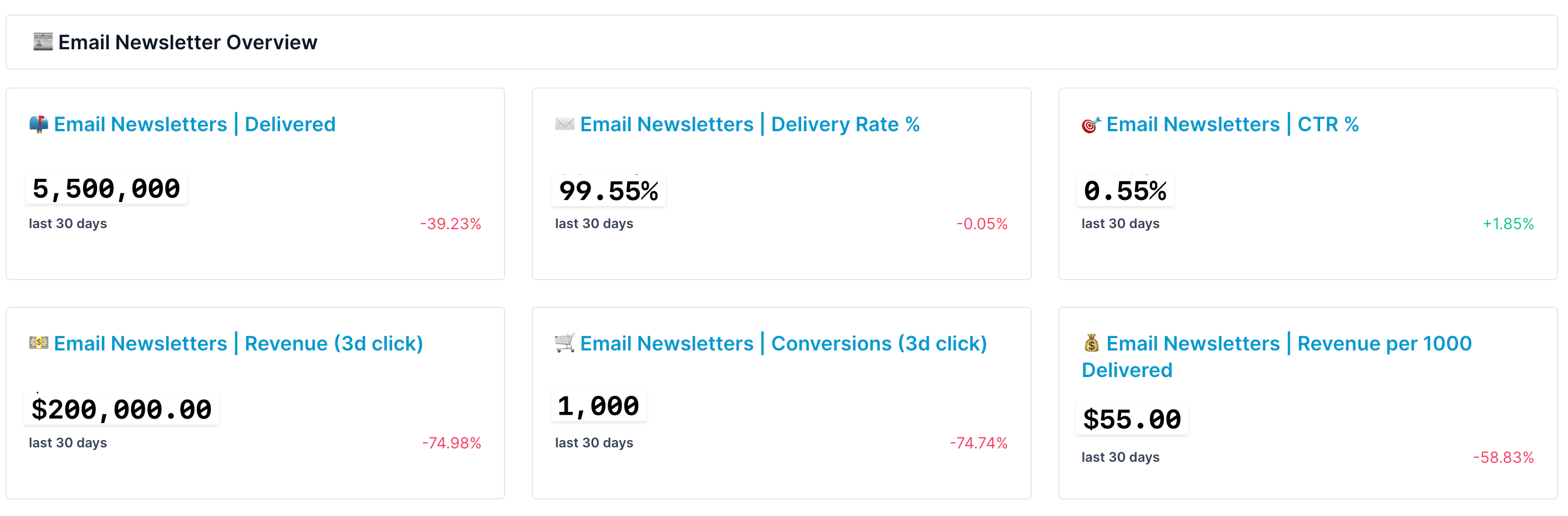
Email Newsletter Performance KPIs
When it comes to metrics, we don’t believe there’s a need to reinvent the wheel. At a high level, we focus on six core KPIs that consistently provide the most meaningful insight into newsletter performance.
We typically do not monitor open rates, as this metric has become increasingly unreliable due to a high volume of bot-generated opens.
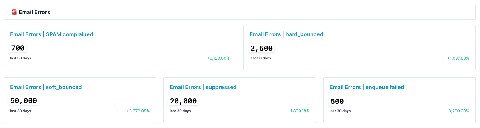
In addition, we closely track email delivery errors. This includes metrics such as hard bounces and soft bounces, which are critical to keep low—especially for maintaining overall email domain health. These are monitored alongside other system-related error metrics that we aim to keep at a minimum.
Another report we regularly rely on to maintain strong email domain health is a breakdown of newsletter performance by subscriber email health segmentation and subscriber lifetime value (LTV).
This view gives us clear insight into which subscriber segments are responsible for specific portions of the revenue generated.
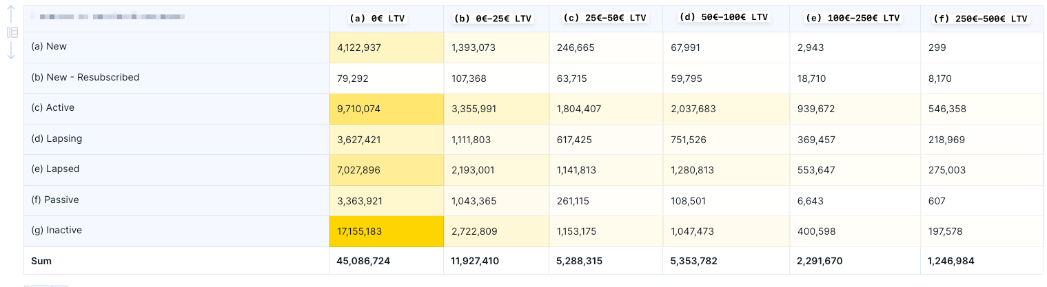
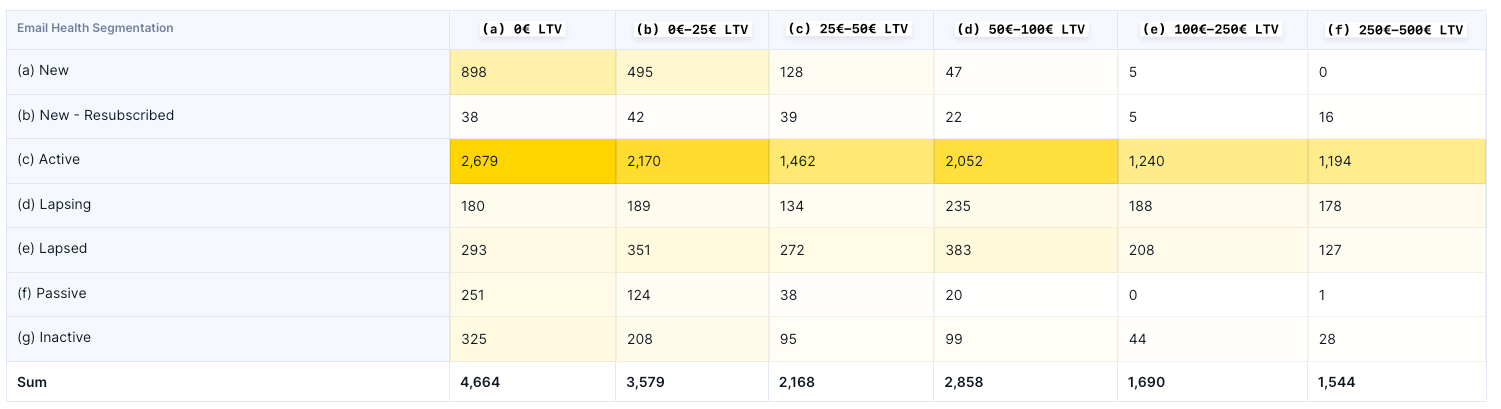
For example, as shown in the screenshots above, inactive subscribers who have never placed an order received a total of 17 million emails, yet generated only 325 orders.
Based on this, we recommend excluding this segment from email marketing campaigns. Doing so would help improve overall email domain health, which should lead to better inbox placement and, ultimately, higher order volume from newsletter campaigns.
Email Flows (Triggers) Performance KPIs
For email flow metrics, we start with the same core set of KPIs used for newsletter campaigns. However, performance is typically stronger—particularly for metrics such as CTR and revenue per 1,000 delivered emails.
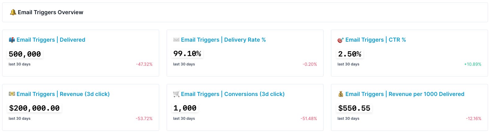
Monitoring errors is arguably even more important for triggered emails, due to the nature of their setup. Unlike one-off sendouts, triggered emails rely on logic defined within Bloomreach scenarios, where errors can occur at various points in the flow.
In this type of reporting, we also monitor daily statistics for each flow to ensure that every flow is triggering as expected. This allows us to quickly identify anomalies and confirm that error rates are not increasing beyond normal levels on a day-to-day basis.
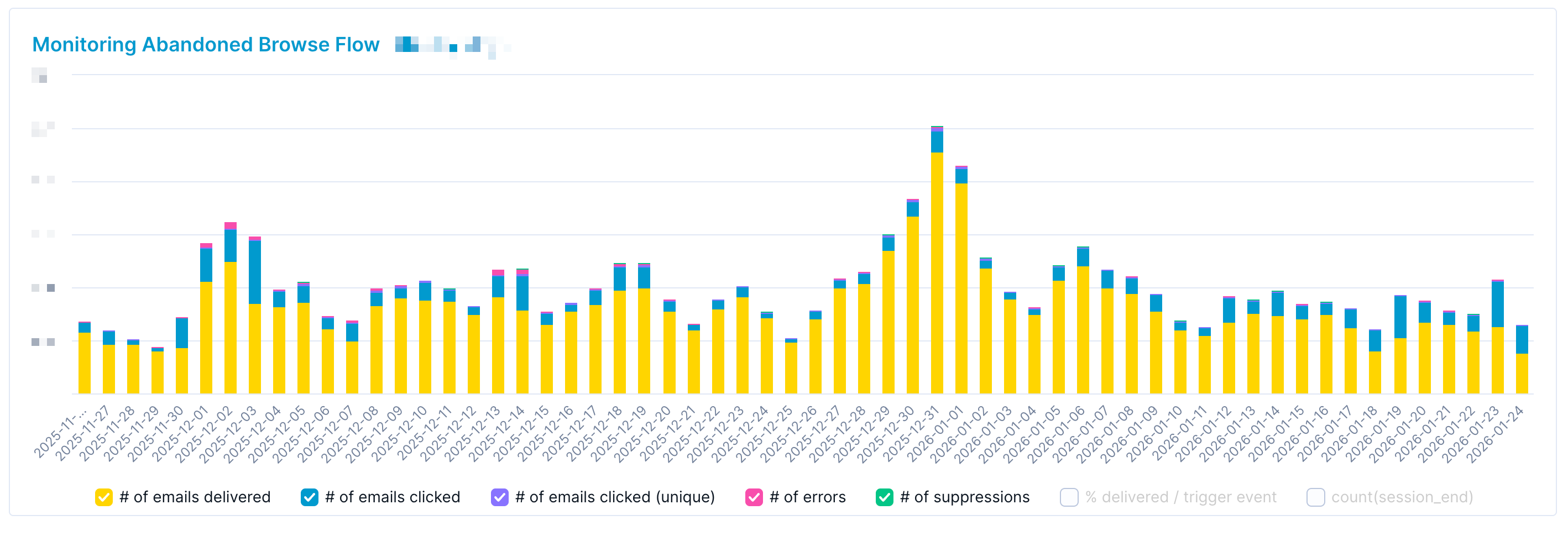
We usually recommend setting up a separate dashboard for each flow. To better understand which metrics are included in these reports, please refer to our article where we take a deeper dive into our framework for evaluating specific triggered flows.

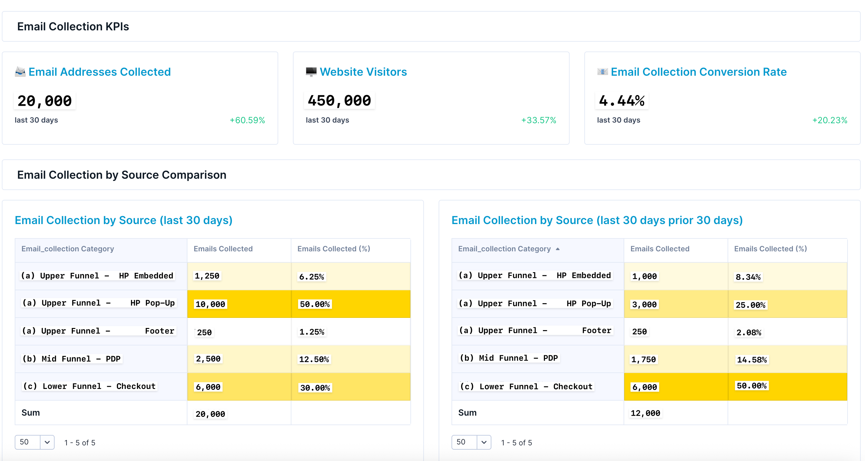
Email Collection Performance KPIs
When it comes to email collection, the most important metric is the number of new subscribers acquired. It’s also valuable to measure this as a proportion of overall new traffic.
In addition, we monitor which email collection touchpoints generate the most subscribers. Based on our experience, checkout is typically the top email collection source for most eCommerce companies.
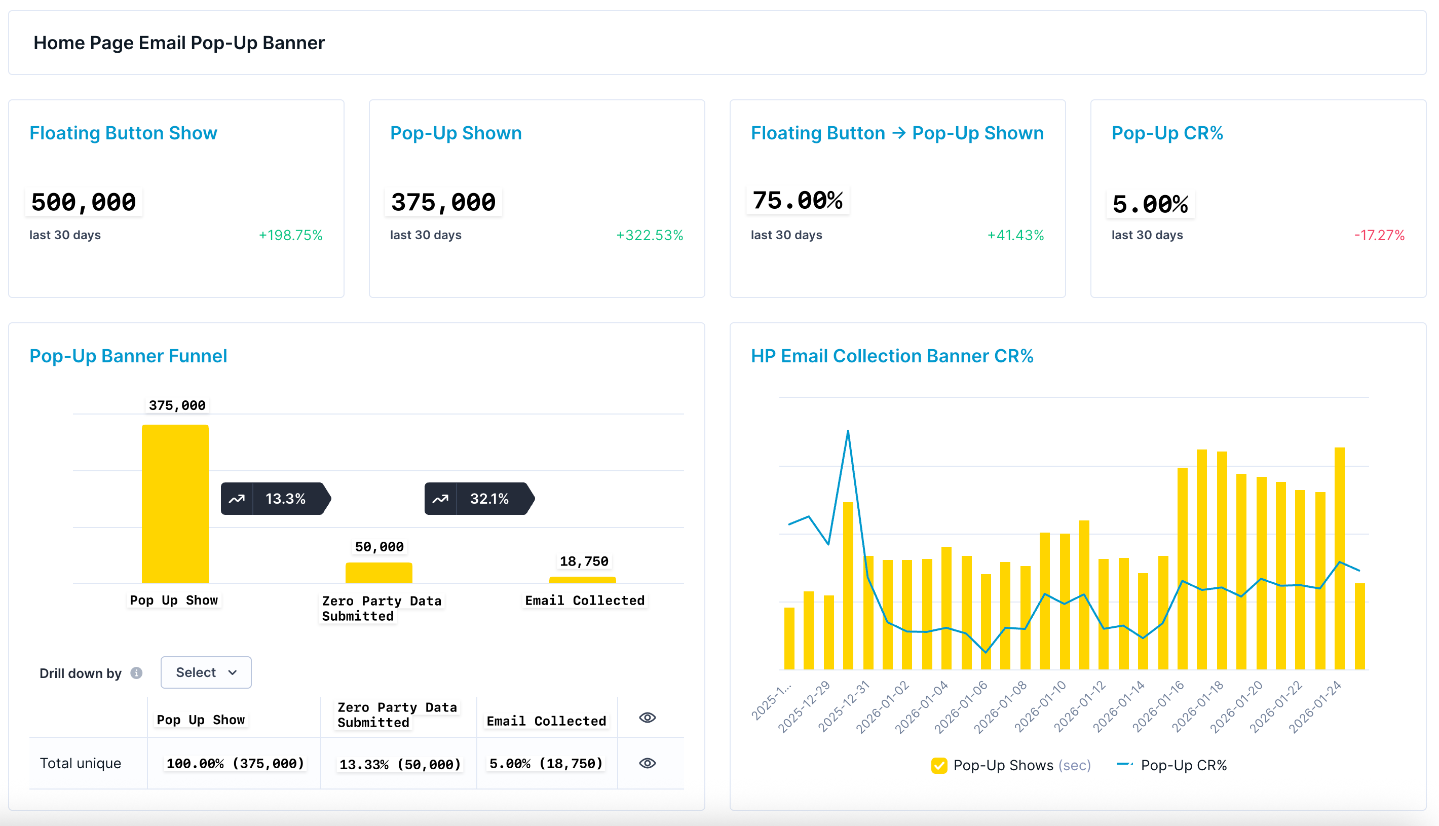
The report then includes a dedicated section for each email collection touchpoint. For example, this is how we typically monitor an email homepage pop-up banner with two key features:
Floating sticky button. This feature allows users to reopen the email sign-up pop-up even after closing it. In the GIF below, it appears as a “Messages” button on the right-hand side of the page.
Zero-party data collection prior to email collection. As shown in the example below, we first ask customers about their favorite sport and only then request email marketing consent. This approach often performs better than asking directly for an email address.

The report then highlights several key conversion points:
Banner visibility. How many people who saw the “floating pop-up button” actually viewed the banner itself? In our case, this is approximately 75%, a figure that is strongly influenced by reducing the delay before the email pop-up banner opens automatically.
First-step engagement. Of the users who saw the first step of the banner (“What’s your go-to sport?”), 13.33% selected an answer.
Email marketing consent. Finally, 5.00% of users who viewed the first step of the banner provided email marketing consent.
This report can then be used to support A/B testing of different email collection strategies. We recently published an article outlining the key areas that can typically be A/B tested for homepage pop-up banners and other email collection touchpoints.

Email Subscriber Performance KPIs
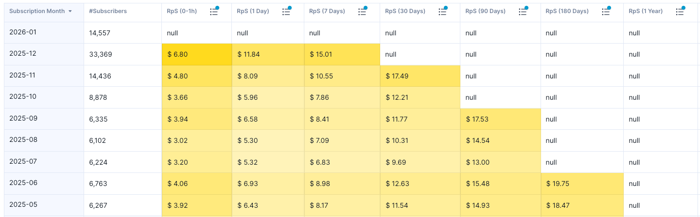
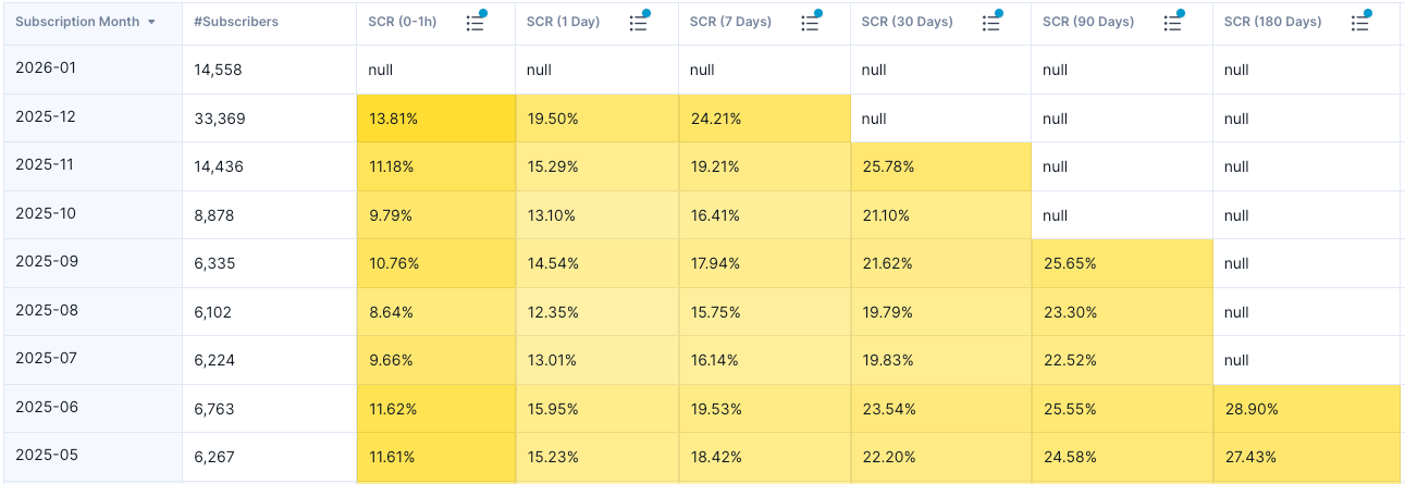
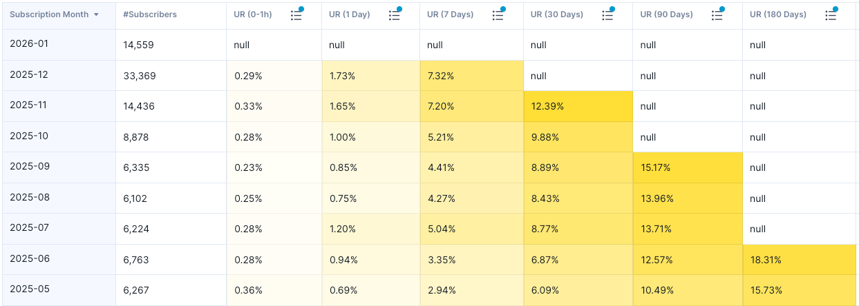
Lastly, we have email subscriber performance reporting. We typically track three core metrics:
Revenue per Subscriber: The average revenue generated per subscriber within a defined time period after subscription.
Subscriber Conversion Rate: The percentage of subscribers who convert into purchasers within a defined time period after subscribing.
Unsubscribe Rate: The percentage of subscribers who unsubscribe within a defined time period after subscribing.
It is important to measure all of these metrics within a consistent time window after subscription. Why?
For example, if you compare Revenue per Subscriber for users who subscribed in November 2024 versus November 2025, the November 2024 cohort will almost always show higher revenue simply because those subscribers have had more time to make purchases.
To ensure a fair, apples-to-apples comparison, metrics should be evaluated within the same post-subscription timeframe—such as the first 30 days after signup. This approach allows for meaningful and unbiased comparisons between different subscriber cohorts.
How can you use these metrics?
One of the most valuable use cases is comparing different subscriber cohorts to understand performance differences between them.
For example, you might be evaluating two email collection tactics:
offering a flat 10% discount, and
offering a chance to win a weekly giveaway.
Giveaways often generate a higher volume of subscribers, but the key question is whether those subscribers convert and generate revenue in the same way as subscribers acquired through a flat discount.
By analyzing Revenue per Subscriber, Subscriber Conversion Rate, and Unsubscribe Rate, you can answer this question effectively and make data-driven decisions about which acquisition strategy delivers more revenue overall.

If you found this post valuable…
We hope this article was valuable to you. If you enjoyed it, don’t miss out on future articles—subscribe for free and have our latest content delivered straight to your inbox.
If you’d like to discuss any aspect of eCommerce technical marketing with us or explore potential collaboration, feel free to schedule a meeting using the link below:
🤔Inspiring read.