Email & SMS Collection for eCommerce: An Ultimate Guide
This is the only article you need to fully understand how and why to collect more email addresses as an eCommerce brand.
About the Author:
Co-founder of Datacop, agency that fulfils marketing operation roles in large eCommerce companies such as OluKai, Melin, Roark, Visual Comfort and Company, Dedoles and others.
Today, we continue our series on the key areas of expertise within the marketing operations department. In previous articles, we covered first-party and zero-party data collection. Today, we’ll focus on strategies for collecting email and SMS contacts.
We'll begin by exploring the business case for email and SMS marketing, followed by a comprehensive overview of the methods we use to collect emails and phone numbers for owned channel marketing.
Why Collect Emails and Phone Numbers from Website Visitors?
Some time ago, we conducted an analysis comparing the lifetime value (LTV) of three groups: customers not subscribed to email or SMS marketing, customers subscribed to email only, and customers subscribed to both email and SMS.
Note: In this analysis, LTV was calculated as the average order value (AOV) multiplied by the purchase frequency.
As the analysis shows, the average order value (AOV) doesn’t vary significantly between groups. However, purchase frequency does. Customers subscribed to email had a 24.2% higher LTV, driven by increased purchase frequency, while those subscribed to both email and SMS saw a 42.43% higher LTV for the same reason.
From our perspective, this is the only analysis you need to make a strong case for email and SMS marketing. Calculating the ROI (from email and SMS channels) is relatively simple. Estimate how many non-subscribers you can convert into either email or email and SMS subscribers, and then multiply that number by the incremental revenue gained from each subscriber compared to a non-subscriber.
How To Collect Email Addresses?
Who Should You Ask For Providing an Email Address And When?
First of all, you should not be asking an email address from somebody who already gave you one. To a customer that has already shared their email with you in the past; it will add friction to their shopping journey. This is where CDXP’s ability to identify any visitor who comes to your website in real time comes really handy.
For visitors that already provided their e-mail address you should:
Exclude customers that have a valid email address from any targeting settings of Email capture weblayers. At this point of the customer’s journey they are only a distraction.
Replace any section on a website asking for an e-mail address for those customers. Again, these parts of the website are irrelevant for the website visitor at this point.
Consider pre-filling their email address or contact information in the checkout forms, in order to speed up buying process. (be careful with these tactics however, some customers may consider them creepy).
A more customer friendly way to pre-filling contact information in the checkout is to do two things. First, only target customers who have purchased with you; not just shared an email with you. Second, when a returning customer enters the checkout, give them an option to “pre-fill” the checkout form with their remembered information by clicking a button. This button could be an element added onto the checkout page itself or served to a customer via a weblayer.
What Are the Different Ways eCommerce Companies Collect Email Addresses?
1. Checkout
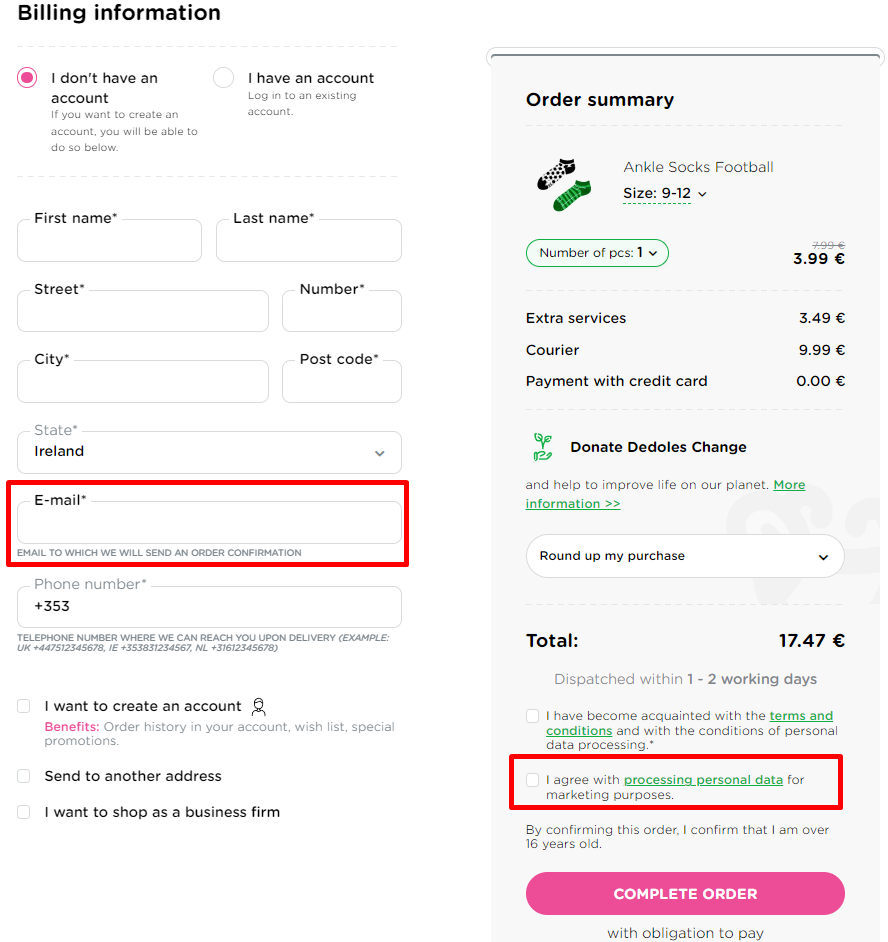
In our experience, the checkout process is the primary source for collecting email addresses for marketing purposes in many ecommerce businesses.
During checkout, customers must provide their email address as part of the order creation process. However, it is crucial to obtain the necessary marketing consent to comply with regulations like GDPR before sending any marketing newsletters.
Additionally, the wording next to the checkout consent checkbox is incredibly important. A simple adjustment in the text led to more than a 250% increase in the number of email subscribers, as we discovered with one of our clients:
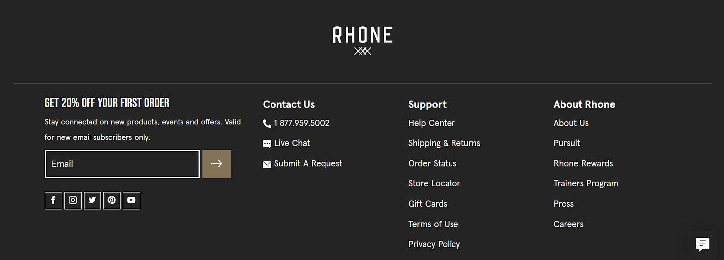
2. Website Footer
The website footer is the section of content at the very bottom of a website. Most of e-commerce websites that are collecting emails use it for email collection and easier website navigation. You can often find a simple sign up form placed and also a discount or a shop benefit if you sign up for the website's newsletter. There are many ways of designing a website footer so it is also an attractive part of the website. However not every customer scrolls down to the footer and that is why we consider it mostly an additional email collection strategy and not a primary one. Email collection using the website footer is often advised to combine with instant pop-up windows or regular pop-up windows.
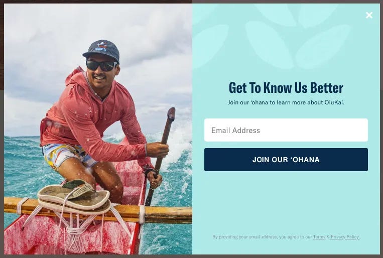
3. Email Pop-Up Banner
When you visit an eCommerce store for the first time, it's highly likely you'll encounter an email sign-up pop-up banner. Typically, these pop-ups offer an incentive in exchange for subscribing to the store's newsletter. Here are some popular examples:
Shop Benefits: Early access to sales, sneak peeks at new arrivals, or a generally engaging newsletter.
Flat Discount: A straightforward discount that applies to all products or services.
Giveaway: Offering visitors the chance to win prizes through contests or daily giveaways.
Choose Your Discount: Let customers select from a range of discount options instead of offering a flat rate.
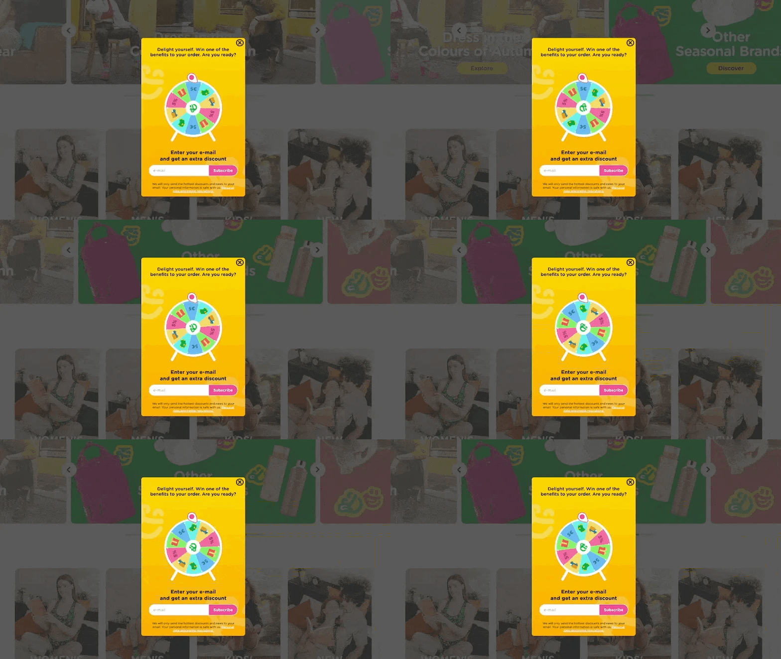
Wheel of Fortune: A fun, interactive way for customers to spin a digital wheel and win discounts or prizes.
The choice of incentive depends heavily on your brand, but we also recommend A/B testing these strategies to find out which works best for you. For example, daily giveaways often attract a higher number of email subscribers, but on average, these subscribers tend to have a lower lifetime value compared to those acquired through other methods. It’s important to determine whether it's more profitable for your business to acquire a larger number of lower-value subscribers or fewer, higher-value subscribers.
4. Email Pop-Up Banner with a Floating Sign-Up Button
Have you ever been browsing an online store when a pop-up asks for your email, and, like many of us, you instinctively close it, continuing to browse without giving it a second thought?
As you explore the website further, you start to like what you see. Now, you'd be open to signing up for the newsletter or receiving a discount to make your purchase decision easier—except the email sign-up form is nowhere to be found, and the pop-up won’t appear again.
If you want to take your email collection strategy to the next level, consider offering users the option to "minimize" the email sign-up banner.
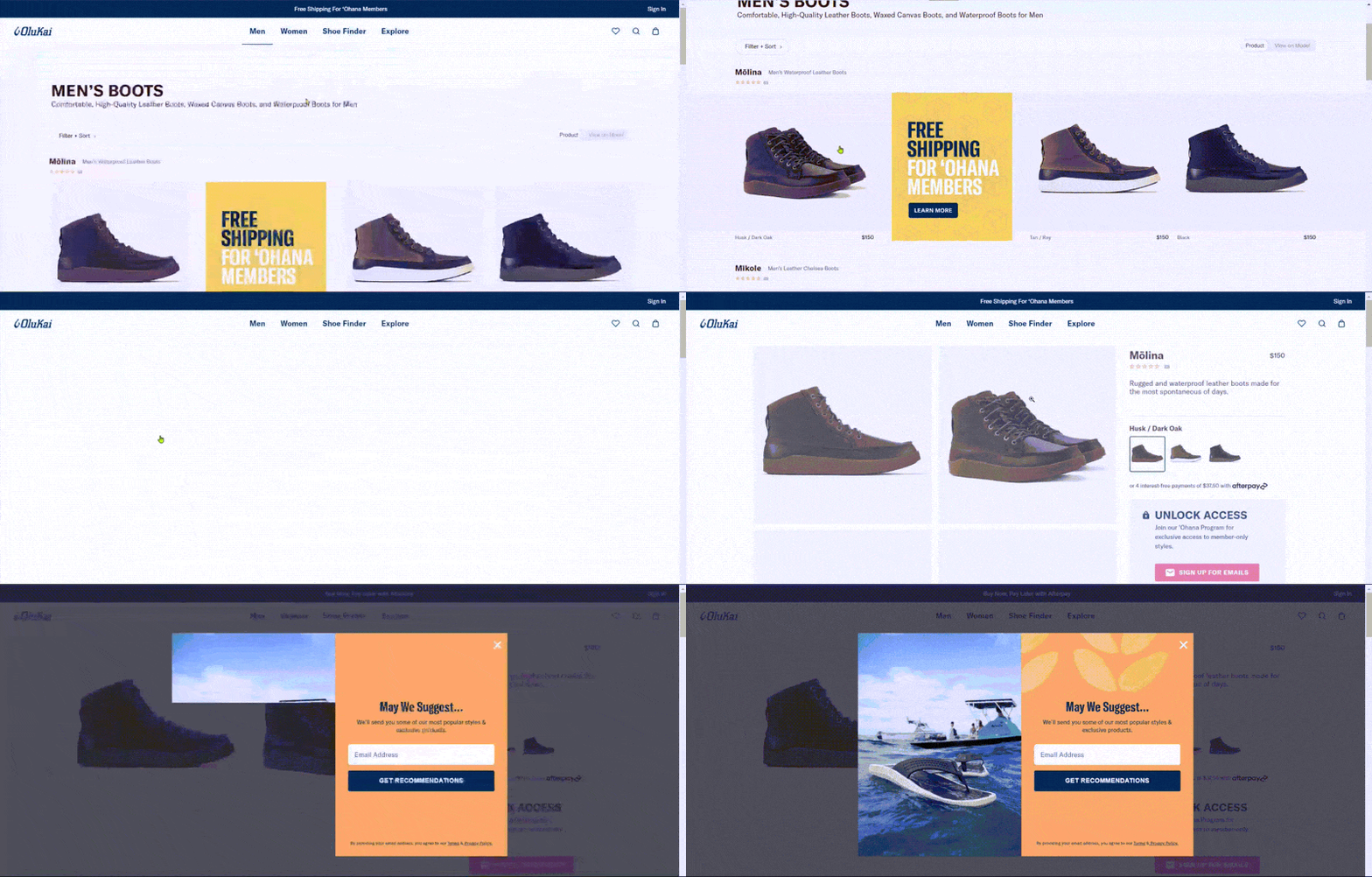
One effective solution is a "floating sign-up button" that appears after the customer closes the initial pop-up. This button follows the user as they navigate the site, staying unobtrusive in a corner. It doesn’t disrupt the shopping experience but serves as a gentle reminder of the opportunity to receive a discount, shop benefits, or valuable content through your newsletter.
We’ve developed a customizable Bloomreach Engagement template specifically for this type of email collection banner. To access it, please refer to the following article:
5. On-Exit Email Collection Banners
Another recommended strategy for new users are on exit pop-up banners, that trigger when customer shows an intent to leave your website. An on-exit behaviour is identified via the visitor moving their mouse cursor beyond the screen of the browser (usually doing so to switch tabs or close the tab).
For mobile devices, on-exit triggers are more tricky to implement because the mobile device lacks a mouse cursor for browsing and therefore it is more tricky to identify the intent of the customer to leave the site.
There are a few of options that can be implemented on the mobile to trigger as an “on-exit” intent such as:
Percentage-based scroll → once a customer scrolls deep enough on a particular page
Your visitor is hitting “back button” → (this depends on the kind of mobile browser used)
Your visitor is hitting “tab switch” button → (this depends on the kind of mobile browser used)
6. Get a Discount on This Product by Subscribing
Instead of, or in addition to, offering a flat percentage discount through a pop-up banner, consider displaying a message directly on the Product Detail Page (PDP), just below the "Add to Cart" button. This message can inform customers of the exact amount they would save on the item by subscribing to your email newsletter.
7. Refer a Friend
A “refer a friend” strategy allows you to potentially collect two emails in one form. The banner prompts the visitor (if they haven’t already shared their email) to enter their own email as well as the email of a friend. The friend then receives an email from the visitor (facilitated by your ESP), offering them a discount. If the friend clicks through, they are prompted to sign up and confirm their identity.
However, “refer a friend” strategies are more complex when it comes to GDPR and data privacy regulations. Since the shop hasn't collected consent from the “friend” and legitimate interest doesn't apply (as there’s no direct relationship with the friend), it’s crucial that the email is clearly sent on behalf of the customer who filled out the form. When the friend clicks through the email, they land on a page that asks them to enter their email to receive the discount. Be sure to include a checkbox for the friend to opt-in to your newsletter. If they check this box, they are added to your mailing list.
Here is an example of a “refer a friend” collection banner in use:
This an example of how the received email looks like to the friend:
Referring a Product to a Friend
A more personalized approach to this email collection strategy is to offer customers the option to refer not just your brand, but a specific product from your site. This option could be available as a button on the Product Page, inviting customers to refer that product to a friend. As a result, the referred friend receives an email featuring a product personally recommended to them.
This approach has several benefits. It gives the friend a more compelling reason to click through and explore the site, as the email highlights a specific product tailored to their interests rather than relying solely on brand appeal. Additionally, it provides an extra opportunity for your brand ambassadors to share and promote your products. It’s also a fun, interactive feature that encourages visitor engagement.
8. "Notify Me When Available" Button: PDP
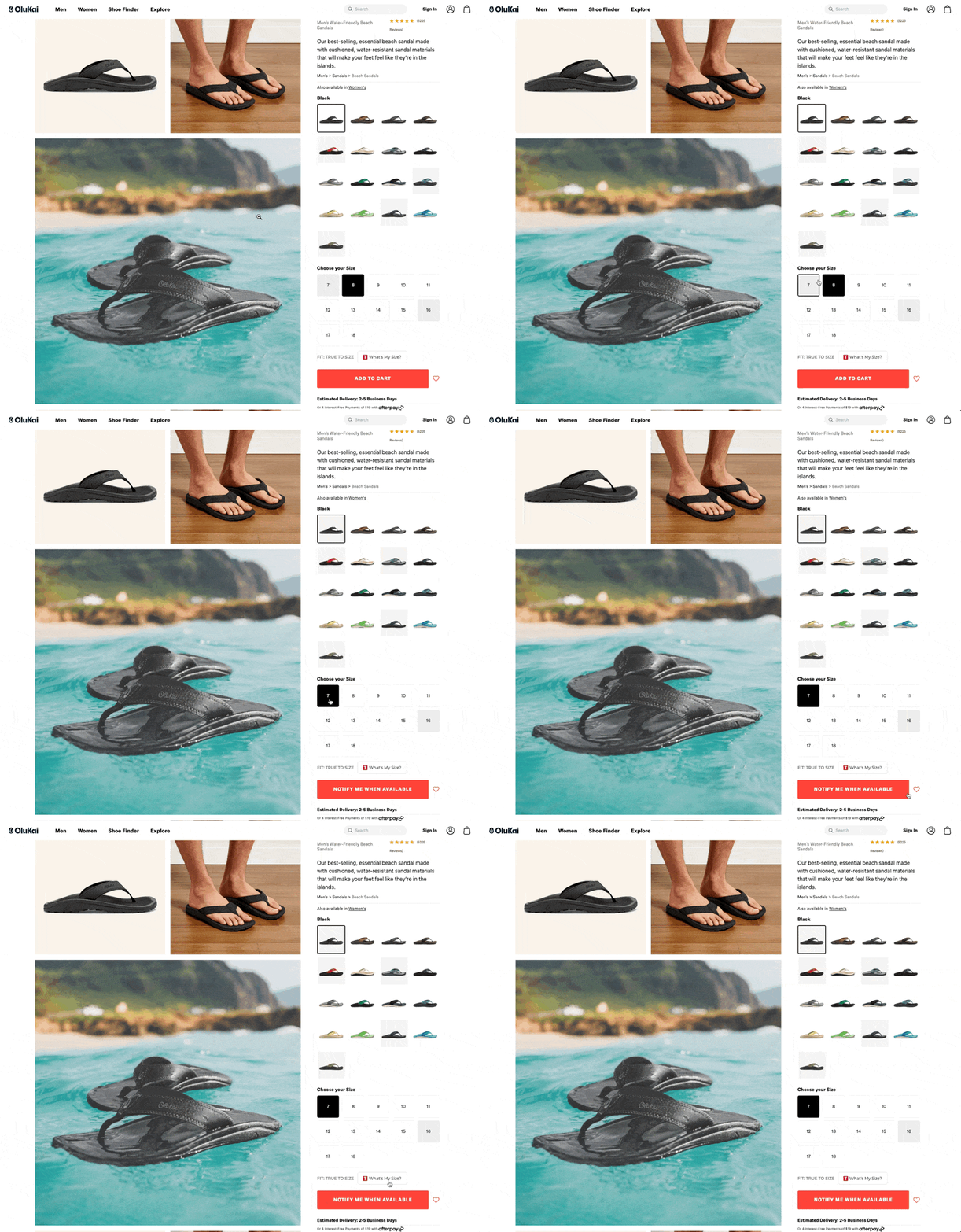
When a customer’s preferred size is out of stock, it presents a valuable opportunity to collect their email or phone number for future notifications. This feature can be seamlessly integrated into the Product Detail Page (PDP). If a customer selects a size that is unavailable, the "Add to Cart" button can be replaced with a "Notify Me When Available" button. This allows customers to receive direct updates when the item is back in stock, ensuring they stay informed and engaged with your brand.
9. [Advanced] "Notify Me When Available" Button: PLP
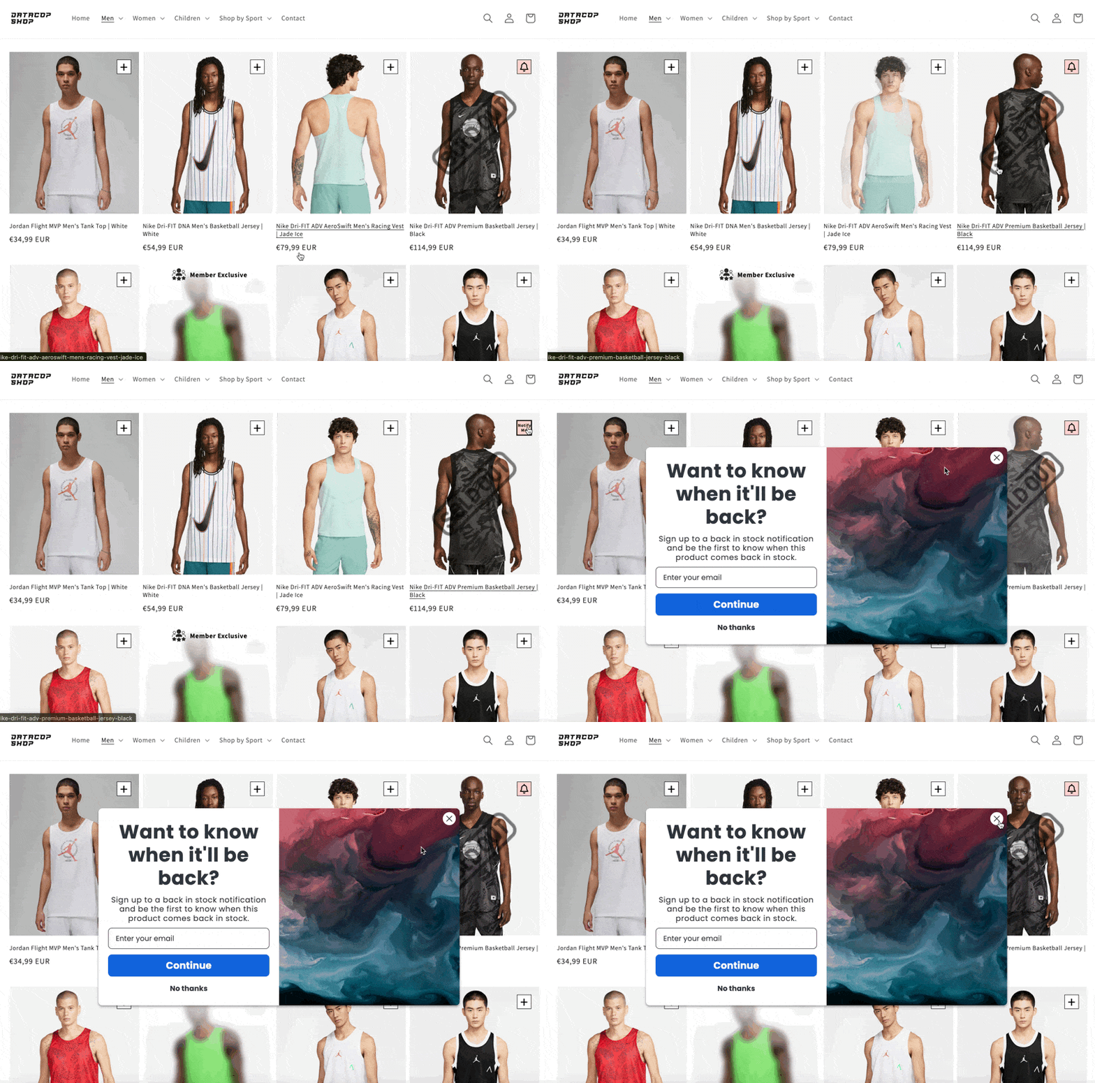
If you know a customer’s preferred size and a product is out of stock in that size, you can implement a "Notify Me When Available" button directly on the product collection page. Here’s an example of how that experience might look:
If you're wondering how to collect this information, here’s a full article that explores the topic in more detail:
10. [Advanced] Semi-Gated Experience
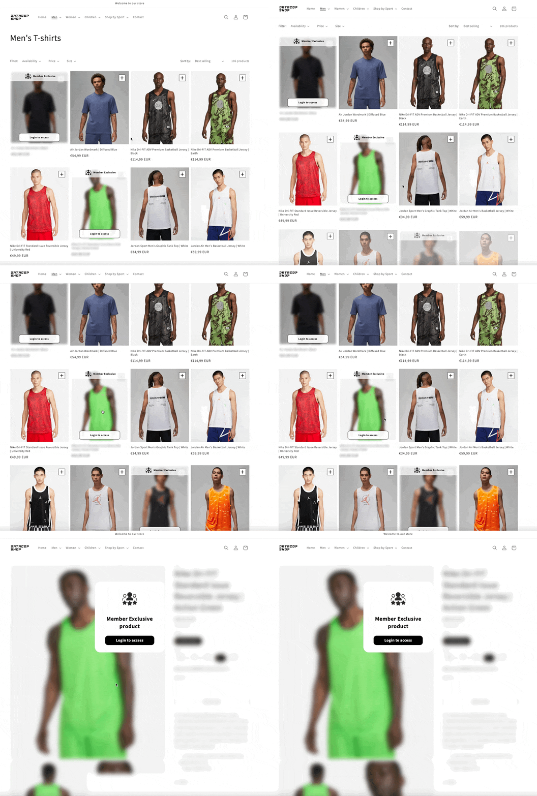
Imagine offering a portion of your product lineup—such as exclusive or discounted items—available only to registered users. This creates a semi-gated experience. While this email collection strategy is still relatively new, we believe it will become more common for two key reasons:
It allows eCommerce companies to gather a significant number of email addresses for their newsletter.
It has substantial positive implications for accurate digital identity of your customers, which directly contributes to increasing revenue.
Given the growing importance of this strategy, we've dedicated an entire article to explore it further:
Here’s an example of a semi-gated customer experience, where a portion of the product offering is accessible only to logged-in users:
11. [Advanced] Website Questionnaires
We previously mentioned this strategy as an effective way to collect customer preferences or zero-party data. However, it’s also a great method for gaining new email subscribers.
I’m referring to website questionnaires that many retailers have successfully integrated. Below are screenshots from the questionnaire implemented by Doe Beauty. As you can see, the final step asks customers to provide their email address for marketing purposes:
Email collection step:
12. Retention.com - US only
Retention.com is by far the most effective email collection strategy we’ve encountered to date.
Traditional email pop-up banners typically capture around 2-3% of email addresses from website visitors. However, Retention.com can comfortably increase this to double-digit percentages.
Retention.com is designed to help businesses identify the email addresses of anonymous website visitors, even if they haven’t explicitly shared their contact details.
However, it’s important to note that this method is illegal in the EU, as it does not comply with GDPR regulations.
For a more in-depth explanation of how Retention.com works, here’s a video from its CEO:
SMS Collection Strategies
Many of the strategies we’ve discussed so far can also be applied to SMS collection. However, we’d like to highlight two additional approaches specifically for customers who are already subscribed to your brand’s email communications.
13. Subscribe to SMS: Dynamic Email Snippet
For email subscribers who haven’t yet opted in for SMS notifications, consider adding a dynamic snippet to your email newsletters. This snippet should clearly communicate the key benefit of subscribing to SMS marketing. See the example below:
14. Discount Incentives for Cart & Browse Abandonment: SMS Subscription
This strategy targets customers actively engaged with our email marketing but who haven’t yet subscribed to SMS updates. In cases of cart abandonment, browse abandonment, or other key automations like back-in-stock or low-stock alerts, you can offer an incentive: a discount for signing up for SMS notifications. This offer can be highlighted in the subject line of these emails or prominently showcased within the email itself. See the examples below:
If you found this post valuable…
We hope you found this article valuable. If so, please consider subscribing (for free!) to receive updates on our latest publications.
Additionally, if you'd like to discuss any aspect of marketing operations in more detail, feel free to book a meeting with us using the link below:


